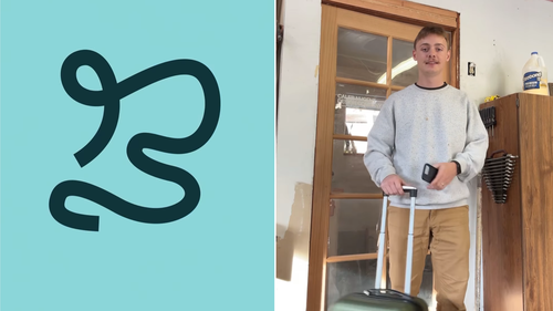
Caleb Nugent, the co-founder of BrandFoundry Collective, unveiled a new city logo design based on the shape of the river that snakes through the city, conveniently in a loose “B” shape.
The logo came at the request of Instagram account @brisbane, a privately owned platform that is not the city’s official tourism brand.
Lord Mayor Adrian Schrinner was one of many to praise the design, sharing it on his Instagram account.
“Everyone’s getting inspired by Brisbane,” he wrote.
“@calebnugentdesign has put forward some great ideas to help pitch Brisbane to the world.
“But the only way to capture the buzz of Brisbane is to experience it in person.
“What do you think of Caleb’s rebrand?”
Schrinner’s office has today confirmed there is no meeting planned with Nugent and the city had not funded the trip.
Nugent, who lives in Oregon, had never been to Australia, let alone Brisbane, before this week.
His design business is less than two years old.
“I take the little (Google Maps) street view guy. I hover over the state and I drop a little pin somewhere on the map and wherever I land… if there’s a business nearby, I take that business and and give it a new look and rebrand it just like we would for clients,” he told Bignasca.
“That’s the content that I’ve been doing that’s been getting the most attention.”
When the @brisbane account commented asking him to design a logo for the city, he decided to take it on as an “afternoon project”.
“I was like, well, okay, I guess I’ll just take a look at the city from above and see what pops out and it was really cool because immediately that B was so visible,” Nugent said.

